Regardless whether you are an engineer or a writer, a professional or a student, a business person or a scientist, you will be expected to communicate effectively with your supervisors, colleagues, clients, and the public. For most, that communication includes at least an occasional formal presentation.
Formal presentations in the workplace usually take one of three forms:
- Informational
- Persuasive
- Instructional
Informational presentations are useful for reporting on research or giving a project update. Persuasive presentations can be used to make pitches to clients or supervisors. Instructional presentations, or “how-to” presentations, are formatted to teach, explain, or train.
In technical presentations, like most other genres of technical communication, good visual information design is essential. Visual aids are useful for increasing audience understanding of both the subject and the organization of a presentation.
Presenters should remember they have an array of options for visual aids from live demonstrations to interactive activities to old fashioned white boards; however, presentation software is the most commonly used option. Among the presentation software choices, PowerPoint is widely available and widely used in the workplace and in educational settings. Other software like Presi or Google Slides are becoming more popular and present may of the same opportunities and challenges that PowerPoint does.
PowerPoint can be a very effective tool for students and professionals if it is used appropriately for the purposes of a technical presentation. Unfortunately, effective use of this tool is not as intuitive as one would think considering its prevalence. To more effectively use PowerPoint often requires unlearning many of the common techniques displayed in the typical college class or even in the workplace.
Pitfalls of PowerPoint
Unfortunately, PowerPoint is controversial. Most students have experienced an ineffective PowerPoint presentation. In fact, a 2015 article on the website The Conversation claims PowerPoint “makes students more stupid and professors more boring” (Sorensen). Although this author and others make good points on the ineffectiveness of PowerPoint, others (Horvath & Lodge, 2015) contend that a tool is only as effective as the person using it. PowerPoint does not make students stupid and professors boring; rather, poor use of this tool makes for ineffective presentations and can lead to laziness in both the audience and the presenter.
One issue with PowerPoint is the preset templates and layouts Microsoft provides. These can guide a novice user to make inappropriate design choices that affect usability. For example, reversed text on a dark background can be challenging for audiences to read. Bullet points do not take advantage of the program’s visual potential. Purely decorative designs can distract from functional visuals and text.
Many of the problems with PowerPoint presentations are the result of a tool that is readily accessible being used by individuals untrained in rhetorical and visual design. Fortunately, students of technical communication can implement a change of strategy and follow a few guidelines to use PowerPoint more effectively.
Rethinking Bullet Points
The key to improving your use of PowerPoint as a presentation tool for technical or professional communication is to rethink the usual layout of presentations you have seen. Most poorly constructed PowerPoints have far too much text, usually in the form of bullet points covering, albeit in shortened form, everything the speaker is going to share. Your purpose should not be a mystery to your audience, but the audience cannot both read and listen to what you are saying at the same time. Rather you should treat your slides as true visual aids that primarily use something other than text to support your points.
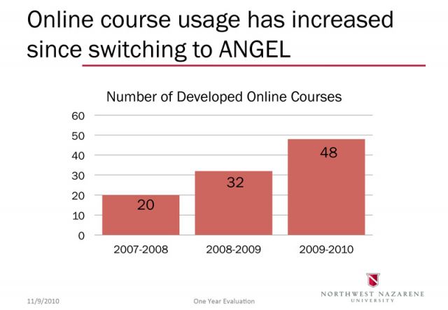
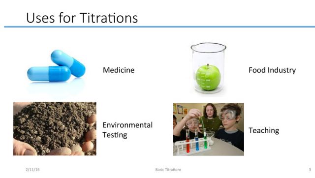
Every substantive slide should present a visual that illustrates or supports the point you are making orally rather than summarizing or reiterating that point in text form. In other words, instead of the typical topic and bullet point slide layout, a more effective strategy for PowerPoint presentations slides can be to offer a claim and a visual support in the form of a photo, graph, illustration, chart, etc. (Alley & Neeley, 2005; Markel, 2009).
Sample slide with claim/visual support layout
This claim/support strategy accompanied by various orientation features creates a presentation that is free from visual noise, complimentary to the oral presentation, and easy for the audience to follow. Creating a PowerPoint presentation of this type requires significantly more thought and effort than a traditional summarizing bullet point format, but the payoff is worth the time spent.
Designing a Claim/Support Style Presentation
Although no one size fits all prescription exists for building an effective PowerPoint slide set for a professional or technical presentation, students can use the following steps and stratagems to guide their process.
1. Plan your presentation before making your slide set.
Rather than sitting down at the computer and opening PowerPoint to begin preparing for a presentation, you should start with your topic—the information you need share, the points you need to make, or the process you wish to teach—and determine what types of visual aids will best support your purpose. PowerPoint may not be the right fit for every purpose. If it is the best tool to employ, remember that the slide set is notyour presentation in and of itself but rather a way to visually support your claims and guide your audience through the organization of your presentation.
Follow the same process you would for any piece of academic or professional writing. Research your subject, narrow your scope to fit the constraints of the assignment, analyze your audience, and draft your presentation around your main points. Once you have a strong, organized case to make in support of your purpose, you can begin creating the visuals that will most effectively enhance your claims.
2. Design your template.
When you are ready to build your slide set, first prepare a slide template. This step will save you time formatting each slide and create consistency. Although PowerPoint provides many predesigned themes, avoid them. Creating your own template will give you more control and help you avoid some of the poor design choices represented in many of the preset templates. Using the “Master Slide” feature is a good way to design once and apply your choices throughout your presentation.
When designing a slide template for the body slides of your presentation, keep in mind these suggestions:
- Opt for a white (or very light) background.
Although, many presentation slide sets use a dark background with light text, a more audience friendly choice is a light background and dark text. This combination is universally easier to read especially on a screen. Another benefit of a white background is that you can use a wider variety of image files and types without dealing with the white boxes that often appear in JPEG image files.
- Prefer a san serif font.
As is true for reading on computer screens, san serif fonts are also easier to read on the large screens of PowerPoint slides. This is not to say that all serif fonts are unacceptable but rather a good rule of thumb is to prefer a san serif font.
- Include an orienting footer.
Be sure to design a footer on your slides that includes the title (or abbreviated title) of your presentation, the date of the presentation, and particularly the slide number. This information is helpful for you in archiving the slide set or changing it for future presentations, but it is especially helpful in orienting the audience. It is much easier to ask a specific question at the end of a presentation if one can refer to specific slide number rather than trying to describe the visual after a single viewing.
- Avoid visual “noise.”
In Presentation Zen, Reynolds explains the principle of signal-to-noise ratio and the effects of cluttering a slide with too much visual information that is unrelated to a point being made. He says, “There is simply a limit to a person’s ability to process new information efficiently and effectively” (2012, p. 134). In other words, avoid unnecessary design elements and visuals on slide in a technical presentation. This means eliminating meaningless clip art, images, or even an organizational logo on every slide in order to focus the audience’s attention on the visual that supports your claim. In most cases, less is truly more on a slide.
3. Create your orienting slides.
In addition to acting a visual aid to support the claims of presentation, the purpose of a slide set is also to help the audience understand the organization and follow the speaker’s thoughts more coherently. Many slide sets miss this opportunity. First, be sure to create a title slide that introduces your presentation and you to the audience. Next, slide sets, even for short presentations, should include an outline. The audience wants to know where a talk is going and when they can anticipate its conclusion. Your point in making a technical presentation should not be a mystery; tell the audience what you are about and show them in the form of an outline slide. Revisit this slide to reorient you audience in the middle of the presentation or even before each major point in a long presentation.
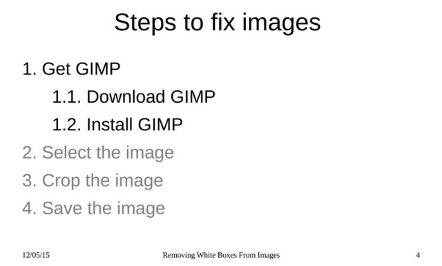
Sample of an outline slide
Another orientation feature that you should consider adding is borrowed from pedagogical theory: the advance organizer. A good presentation should help audience members connect new information to previous knowledge and understand why the information is important to them. This is also the purpose of an advance organizer.
Simply put, the advance organizer in slide set is a slide (or several) dedicated to visually introducing background or introductory material so the audience is prepared to accept the claims of the presentation. An advance organizer may take many different forms depending upon the type and purpose of a presentation. One example is visual “list” of supplies needed to perform a task you are teaching. Another might be a definition of a subject or an image of a finished product that the presentation aims to demonstrate the process of creating. Accompanied by the speaker’s oral explanation or even audience interaction, these slides help orient the audience and prepare them to receive the bulk of the material more effectively.
Sample of an advance organizer slide
4. Lay out your organization.
With a template created and orienting slides in place, you can now deal with the body content of the presentation. Follow the same form you would in presenting information effectively and persuasively in any medium by including the following elements: an introduction, several points (or claims), a conclusion, and a call for questions. The audience is familiar with receiving information in this way and will become confused or fail to recall your purpose if you do not sum up your points in a conclusion, for example.
Another organizational feature on the body slides that can become a missed opportunity is the headers. Many presentation slides employ single word or phrase headers. Research shows (Alley & Neeley, 2005) that this may not be the most effective format to persuade or teach. Alley & Neeley and others (Markel, 2009) advocate for the use of sentence case headers on body slides that make a strong, clear claim in a complete thought. Punctuating and capitalizing them as sentences is also recommended.
Sample of a slide using a sentence case header
Switching to sentence headers can be a challenge for students at first—even the student examples provided below do not fully follow this advice— because it is different from what most of us have experienced. However, using it can be effective when bullet points are eliminated in place of a visual support on each slide.
5. Add your visuals.
The final step, and arguably the most difficult, is adding visuals to the slides to support the your claims. Determining visuals that are effective in emphasizing the points, simple enough to comprehend, within the designer’s ability to create, or available to use without copyright infringement is quite a challenge. The following tips can help you begin to design visually based PowerPoint slides:
- Consider your options.
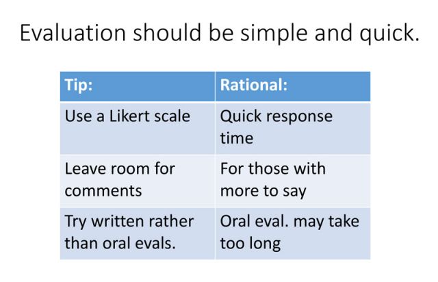
Although challenging to think through whether an idea can be represented graphically, you have many possibilities available that work well in PowerPoint. Good options for visuals include graphs or charts for presenting data, tables for displaying lists (an alternative to bullet points), photographs or screen shots for showing steps in a process, illustrations or line drawings for simplifying complex images or showing internal workings, and PowerPoint SmartArt graphics for demonstrating relationships and processes. These are only a few of the choices available and a few potential uses for each. Once you have an idea of the type of visual to use, you will need to create or find it.
- Create your own visual.
It is always best to create a visual yourself—if you have the programs and skills to do it—because it gives you complete control of the visual and avoids copyright issues. Although some programs for creating visuals are expensive or require specialized skills, others are readily available and easy to use. Consider screenshots, for example. These are simple to create and excellent for demonstrating a digital process. Likewise, most students can take their own photographs at a quality acceptable for presentations. Graphs are easy to make in Word or Excel and transfer into PowerPoint.
- Use the drawing tools in the presentation software.
PowerPoint supplies easy to use tools, such as SmartArt, for creating visuals. You will find these tools intuitive to use, but you must be careful to select diagrams or graphs that accurately match the concept you are attempting to represent. Markel correctly notes, “Microsoft has always done a better job creating drawing tools than explaining how to choose the appropriate one” (2009, p. 126). You must also be careful to avoid design features on these graphics that make them difficult to read and understand. For example, a three-dimensional pie chart can be not only hard to read on the screen but also misleading, particularly if you use color inappropriately. Again, less is usually more; basic designs and simple color schemes are best.
- Find an existing visual.
Sometimes you will not be readily capable of creating your own visual, and will need to find one somewhere else. If you work for an organization, check with the marketing department for photographs and logo files. (They can also supply you branded fonts and colors and perhaps even predesigned company slide templates.) Subject matter experts within your organization may be able to provide technical diagrams, line drawings, cross sections, etc. As a student, you can glean from the Internet helpful images of this kind, but should use them for educational purposes only. Be careful to credit borrowed images, and do not use images without permission for anything intended for a professional setting or for which you or anyone else will gain a profit.
Pulling It All Together
Shifting your thinking about the purpose and design of presentation slides and using the processes and tips provided is not rocket science, but pulling everything together will require careful thought and planning. The following examples show many of the elements discussed here in action. These are presentations created by real undergraduate students. They are not perfect cases, but they offer creative, real-life solutions to the same challenges you will face in implementing this new style of PowerPoint construction.
Conclusion
In addition to the strategy discussed in this article, students creating formal presentations using presentation software should study principles of good visual design. Also, study of graphic design tools for creating visual images would benefit students who need to present technical information frequently. This article certainly does not encompass everything you need to know about using PowerPoint effectively, but implementing the strategies advocated should dramatically improve your presentations.
References
Alley, M., & Neeley, K. A. (November 2005). Rethinking the design of presentation slides: A case for sentence headlines and visual evidence. Technical Communication, 4(52), 417-426.
Horvath, J. C., & Lodge, J. M. (2015, June 26). It’s not PowerPoint’s fault, you’re just using it wrong. Retrieved February 5, 2016, from https://theconversation.com/its-not-powerpoints-fault-youre-just-using-it-wrong-43783
Markel, M. (May 2009). Exploiting verbal–visual synergy in presentation slides. Technical Communication, 56(2), 122-131.
Reynolds, G. (2012). Presentation Zen: Simple ideas on presentation design and delivery. Berkeley, CA: New Riders Pub.
Sorensen, B. M. (2015, April 29). Let’s ban PowerPoint in lectures – it makes students more stupid and professors more boring. Retrieved February 5, 2016, from https://theconversation.com/lets-ban-powerpoint-in-lectures-it-makes-students-more-stupid-and-professors-more-boring-36183.


