The use and spread of infographics has gained viral traction in the professional realm. The term “infographic” is a combination of the two words “information” and “graphic.” The infographic caters to fast-pace, “bottom-line” types of audiences by distilling complex information into a single image. Although infographics can be used in a variety of settings, they fare particularly well in the professional environment during business meetings, training sessions, and sales pitches. In fact, infographics have even become a popular means for job seekers to present their resumes. The beauty of an infographic, in contrast to a traditional alpha-numeric genre, is its ability to quickly make a lasting impression on audiences by appealing to their visual aesthetic.
Once you enter the professional world, consider re-envisioning traditional alpha-numeric genres (e.g. the memo or business report) into more visually impactful genres like the infographic. Below are a few best practices you can leverage as you begin developing an infographic. These best practices can be applied to any genre that is typically created alpha-numerically.
The Invention Process
If you are apprehensive about getting started on your infographic, be assured that the development process replicates a process that you are already familiar with: the writing process. You will notice much overlap between the way you approach an academic essay and the way you approach the creation of an infographic. You may also notice that creating an infographic requires the same amount of vigor and time that an academic essay would require.
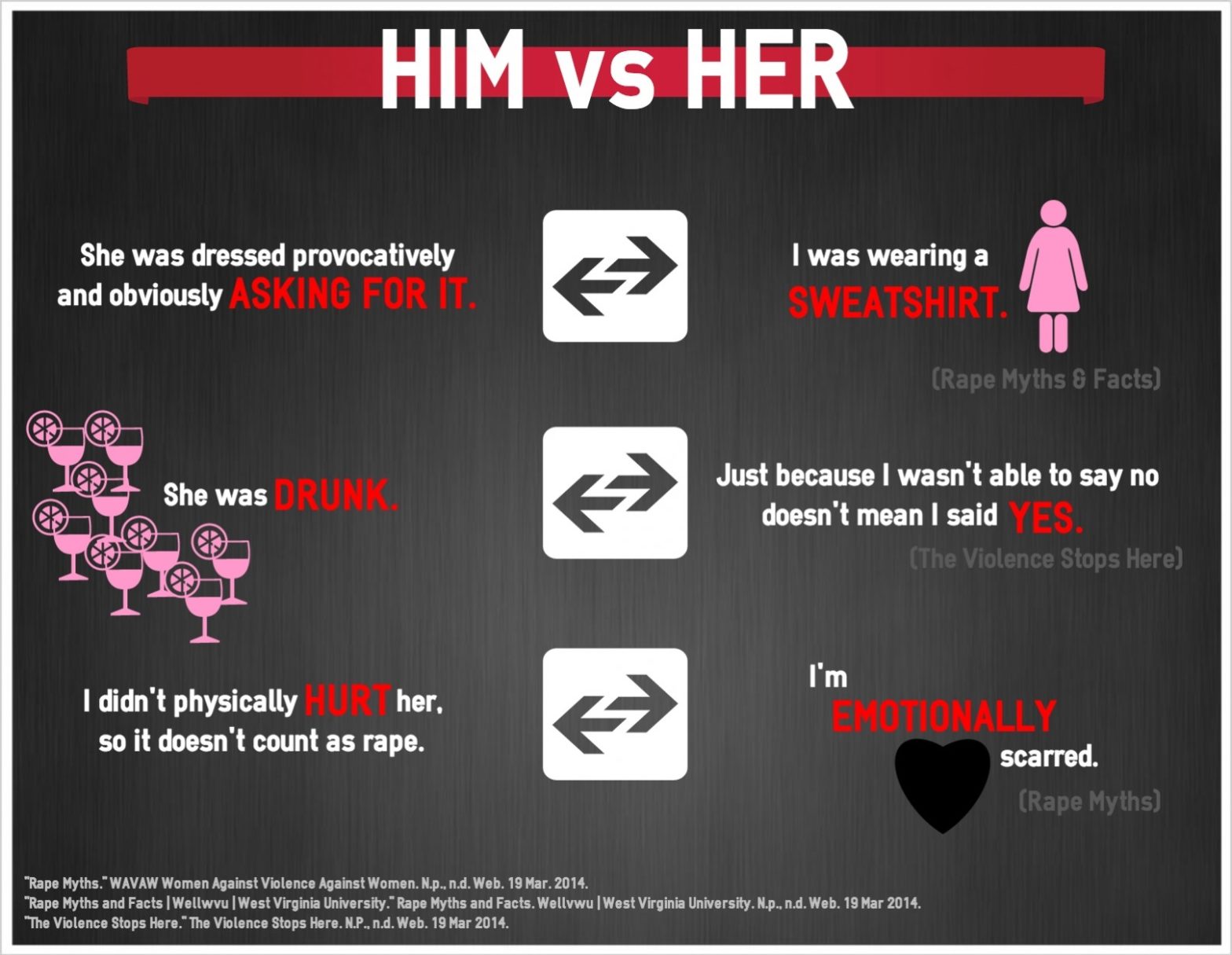
Before thinking about creating infographics as a professional in the work space, you should begin thinking about ways to integrate the use of infographics as a student in the classroom. Identify opportunities to transform alpha-numeric assignments into infographics for a more visually impactful presentation (I would, of course, ensure this route is okay with your professor beforehand). For example, Figure 1 depicts an infographic representation of a controversy analysis essay. A controversy analysis essay explores the multiple perspectives governing an issue and typically takes the form of an alpha-numeric essay. The creator of the Figure 1 infographic, Isha Parol, chose rape culture as her controversy for analysis. When analyzing the infographic, you will notice that it embodies some of the key features that a traditional academic possesses such as evidence, organization, and an (counter) argument. Infographics and traditional essays have many overlapping similarities. Such similarities provide you, as the student, with opportunities to create infographics in lieu of or in conjunction with writing assignments.
Figure 1: “Rape Culture” by Isha Parol
As you begin working through essay assignments or presentations, consider the possibility of leveraging the visual power of an infographic. Parol’s manipulation of color, statistics, and layout creates a “story” of rape culture that is powerfully complex, yet is conveyed simply. Before Parol created her infographic, she spent some time pinning down the story she wanted to illustrate.
Your Infographic’s “Story”
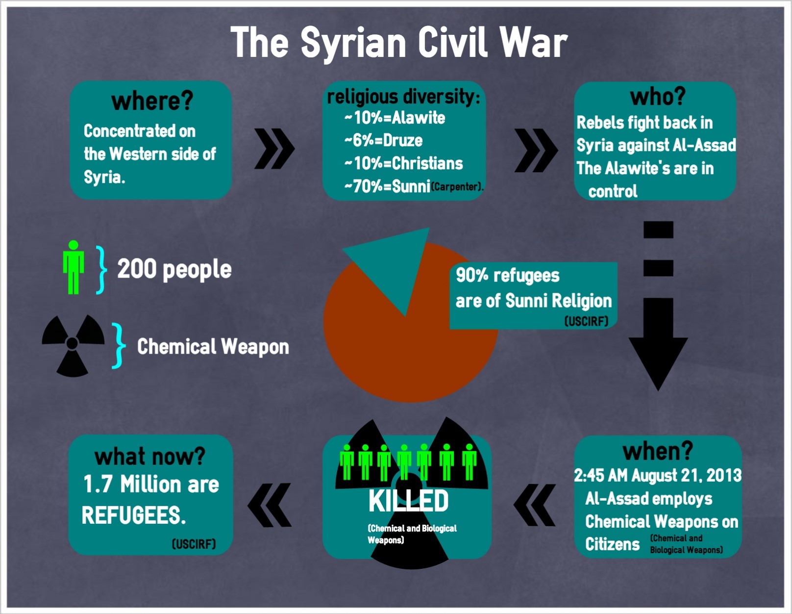
What story do you want your infographic to tell? Perhaps you are striving to illustrate an increase in company earnings or maybe you have been assigned to trace your relationship with reading and writing (i.e. a literacy narrative)? To better grasp the role of the story in relationship to your infographic, you can think about it as operating similarly to a concept you are familiar with: a thesis. The story (or thesis) acts as a cohesive and driving force to bring all elements of your infographic together. Take a look at the infographic below created by a student, Kate Harris. Harris presents her infographic’s story, “The Syrian Civil War,” in a linear fashion. It’s simple yet effective.
Figure 2: “The Syrian Civil War” by Kate Harris
Like a thesis, you should be able to summarize your story with a couple of sentences. Consider typing out your story and keeping it nearby for reference as you develop your infographic—this will help you stay on track. To help solidify the story of your infographic, do consider the rhetorical situation situating your infographic.
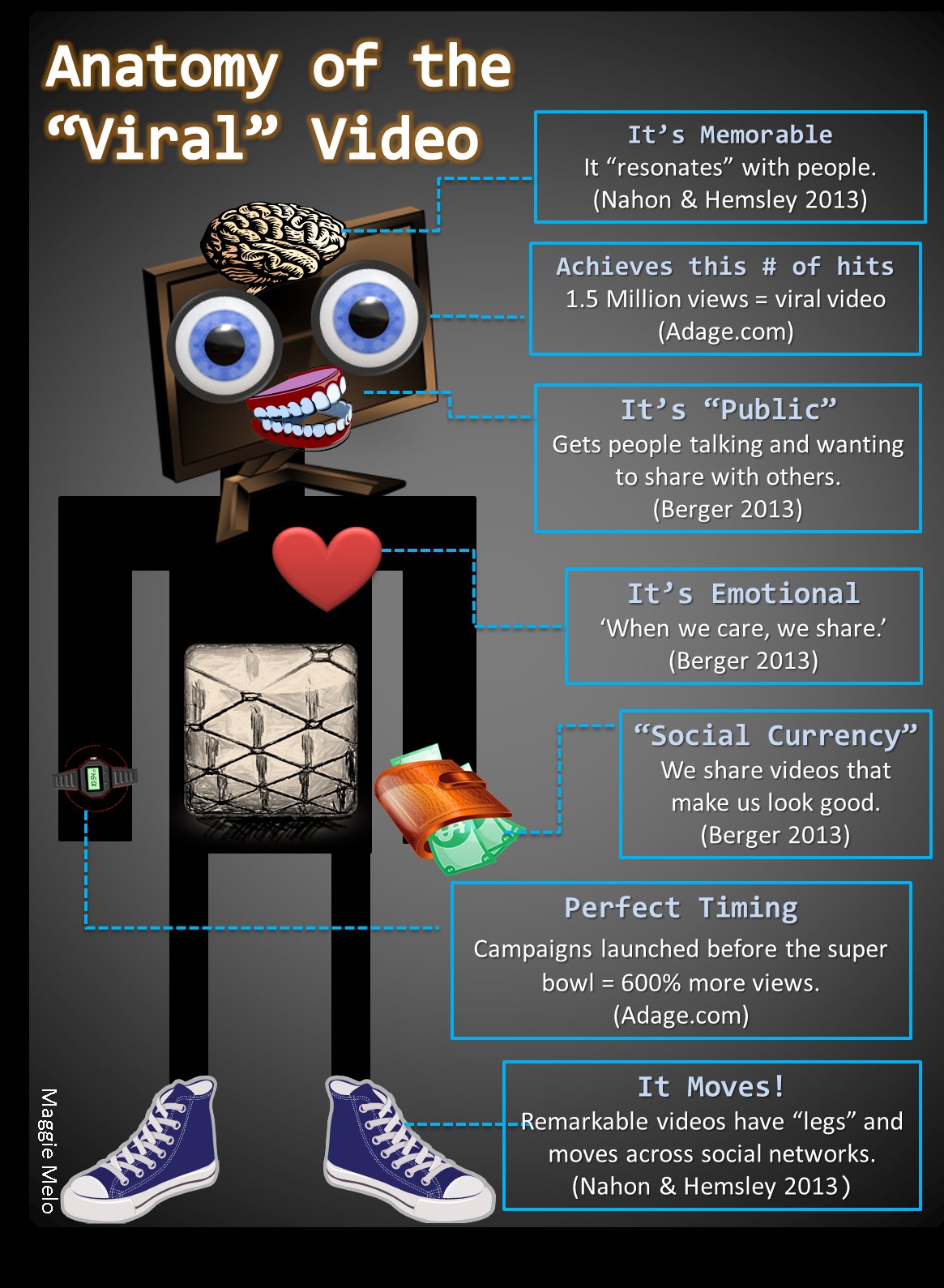
Why are you creating an infographic? Like a written text, infographics stem from a need. Maybe you need to create an infographic in order to complete a class assignment or perhaps you are using an infographic to present training content to new hires; the rhetorical situation governing the need for your infographic will ultimately guide the development of your infographic’s story. Your infographic’s audience, context, and purpose (i.e. the “rhetorical situation”) will help guide your story’s development. Setting some time aside to identify the audience, context, and purpose will be useful. For example, I have created an infographic entitled “The Anatomy of the Viral Video” (Figure 6). Before developing the infographic, I took note of the context governing the infographic by identifying the components comprising a rhetorical situation:
Infographic: “Anatomy of the Viral Video”
Audience: English 101 and 102 students.
Context: I am introducing a unit of the rhetorical features of viral media. At the end of the unit, students will be creating their own viral video on a chosen controversy.
Purpose: To introduce the interrelated characteristics of a viral video.
A quick sketch of your infographic’s rhetorical situation will help support its overall development. For example, when envisioning your infographic’s audience, your infographic’s page size becomes important. Although it may seem insignificant, this small detail can derail the presentation of your infographic to an audience expecting hard copies. (As a side note, if you plan on distributing your infographic, ensure that the size is either “legal” or “letter” so that you or your audience can print it out.) Once you have vetted the rhetorical situation contextualizing your inforgraphic, the next order of business is gathering support for your infographic’s story.
Think of infographics as “data-driven” visualizations. Unlike an ordinary image, an infographic operates by both pleasing the eye while simultaneously informing the brain. The support you need to collect for your infographic (as you probably have guessed) is comparable to the evidence you would gather for an essay you would write. The type of data you will need for your infographic depends on, once again, your infographic’s rhetorical situation. In other words, the data you would collect as a business professional will vary from the sources you would collect as a student. It is crucial to gather the right type of support to establish the credibility of your infographic. For example, the aforementioned infographic “The Anatomy of a Viral Video” (Figure 6) is intended for a scholarly audience: college students. The sources I used to support the infographic included popular websites and scholarly research. (In terms of how to integrate data into your infographic, we’ll touch more on that in the “Creating and Revising Your Infographic” section.)
First Impressions: Shapes and Colors
Molly Bang’s Picture This: How Pictures Work explores the powerful impact that the manipulation of simple shapes and colors can have on readers. Through the positioning and coloring of various shapes, Bang leads readers through a series of visual scenarios of the fairy tale Little Red Riding Hood to demonstrate the authority of shape placement and hue. With Bang’s exploration of shape and color in mind, do remember: the images, shapes, and colors used in the infographic are the main features of the story you are conveying. Text should be used sparingly in an infographic; therefore it is important to be deliberately decisive with the visual choices you implement. The guiding principles of the visual arrangement of shapes and colors help to bring us to the next part of the invention process. Ask yourself: how do you want to represent your infographic’s story visually? If that question is too broad to answer, consider asking yourself this question first: what feelings do I want my infographic to evoke? If you are still stuck, you can consider free-writing or perhaps performing the activity below.
Activity: “Three Shapes to Tell One Story”
Objective: To tell a story through the manipulation of simple shapes and colors.
Materials: Paper of various colors, scissors, and perhaps a writing utensil for tracing.
Directions: Choose one of these words: love, shame, or comfort. These words represent abstract concepts that are complex and challenging to convey with words alone. Moreover, these words are also emotionally evocative. With your chosen word, create a visual image that tells a story representative of your word. You can only use three shapes: circle, triangle, and rectangle. As you develop your word’s story, remain cognizant of the strategies and decisions you are making.
Once you are done, feel free to look at some of the image depictions below. Can you guess which image represents which word? Now that you have an increased understanding of the evocative power of shapes and colors, try practicing the way you wish to tell your infographic’s story with this activity. This activity will help generate a basic conceptualization of your infographic. Once you begin developing your infographic on the computer, don’t feel limited to these the shapes or colors from the activity—this activity is a part of the invention process.
Figure 3: “Shame” by Chris Charter
Figure 4: “Love” by Connor Kerr
Figure 5: “Comfort” by Maggie Melo
Creating and Revising Your Infographic
You are ready to develop an infographic! Choose from a variety of sites such as Piktochart or easel.ly, or from other programs such as PowerPoint. There are several sites that are free of cost. Peruse through various sites to determine which site best suits your infographic’s development. Once you have made your decision, play around with the site. Get a feel for the available design templates, how to place shapes on your digital canvas, how to change shapes and colors, and (most importantly) how to save and share your infographic. Your familiarity with the site’s functionality will help alleviate some of the stresses that come with working with a foreign medium while concurrently trying to develop your story.
It is common to feel overwhelmed with your infographic’s creation, especially if you are using an infographic website for the first time. Remember to leverage your story and understanding of shape manipulation to guide you through what would be considered “writer’s block.” If you still feel stuck, creating an outline or a sketch of your infographic on a separate sheet of paper may help. Although you may be tempted to create a robust outline filled with many figures, images, and text, remember the beauty of the infographic comes from its ability to make a quick visual impression. You should envision how persons would interact with your infographic if they were to approach it on a bulletin board, or break room. In other words, how would viewers interpret your image in spaces where they are constantly on the go? Simple outlines and sketches can be done anytime during the creation process; they will serve as helpful road maps for the formatting of your shapes, images, and notably for the integration of data.
As mentioned, the difference between an ordinary image and an infographic is that an infographic is an image driven by data. While a major function of the infographic is the visual impression it makes, its success is ultimately attributed to the incorporation of statistics and figures. Re-visit the infographics presented thus far in the webtext and pay particular attention to the way the statistics inform the function and meaning of the whole infographic. When the statistics of the infographic are read, it provides readers with a better understanding of the infographic’s story. The infographic “Anatomy of the Viral Video” (Figure 6) can be analyzed in terms of the way data is depicted. Upon first impression, the infographic seems strange but provocative nonetheless. Readers are able to make sense of the image’s peculiarity by reading the integrated evidence. In this instance, each piece of datum corresponds to an image on the viral video’s “body.” The brain represents the “memorable” nature of a viral video, while the shoes indicate the movement of viral videos for example. Before reaching this final layout, the infographic underwent many revisions—considering there isn’t a standard way to integrate data into an infographic. As the creator of an infographic, you have the license to integrate sources you see fit. The tricky part is finding the balance between the visual and data components of the infographic: you do not want one more prominent than the other but instead want them to co-exist symbiotically. Balance will come with some practice, revision, and peer feedback.
Figure 6: “Anatomy of the Viral Video” by Maggie Melo
(An infographic embodies the fusion between data and imagery)
Revising Your Infographic
The revision process for your infographic emulates the same process for a piece of writing and includes peer revision. Once you have created a draft that contains major elements of your infographic such as figures, prominent shapes and images, and text, set up some time to meet with a couple of colleagues for feedback. Here are a few suggestions to contemplate when eliciting feedback for your infographic:
- Give reviewers uninterrupted time with your infographic—about two to three minutes. A reviewer should be able to glean the gist of your infographic pretty quickly.
- Resist the temptation to tell reviewers what they should be seeing or what your infographic’s story is. You have devised a successful infographic if your reviewers arrive to your conceptualization on their own.
- If reviewers are having a difficult time providing feedback, ask: “What emotions does the infographic evoke?” and “What story do you think the infographic is striving to convey?” These questions will provide helpful indicators to gauge if your infographic is operating the way you envisioned.
As you revise your infographic, do consider the way you imagine presenting your creation. Begin storing all of your infographics in a central location (either in a digital or physical repository) so that you may refer to them at any given time. Leveraging the infographics you have created during job interviews, performance evaluations, and meetings is a sure way to leave a lasting impression.
Works Cited
Bang, Molly. Picture This: How Pictures Work. New York: SeaStar Books, 1991. Print.
Charter, Chris. Shame. 2014. Print.
Harris, Kate. The Syrian Civil War. 2014. University of Arizona, Tucson. Web. 30 June 2014.
Kerr, Connor. Love. 2014. University of Arizona, Tucson. Web. 30 June 2014.
Parol, Isha. Him vs. Her. University of Arizona, Tucson. Web. 30 June 2014.


