Page Design – How to Design Messages for Maximum Impact

Page design refers to the strategic placement of information on a page or digital screen: Good page design can help you hook your readers' curiosity and improve readability. Good page design is an essential element of authority in writing. First impressions can make a huge difference with regards to your grades in school and your success with clients in the workplace. You might think of page design as the curb appeal for a house on the market: if you don't make the house (or document!) look inviting, if your document doesn't convey your purpose and information architecture, all is lost: Your audience will move on to something else. There's simply too much competition for your reader's attention. This article reviews strategies you can use to snag you reader's attention, such as working with layout -- especially negative (empty) and positive (filled) space -- typography, information visualization, and color. Learn to design pages to facilitate scanning, readability, clarity, and persuasiveness.

Illustrated open book featuring "What is Page Design?" text surrounded by icons like gears, charts, lightbulbs, pencils, and design elements on a blue background.

Related Concepts

APA General Formatting Guidelines; Elements of Art – Elements of Design; MLA Format Example; Principles of Design; Visual Language

What is Page Design?

Page design is “the strategic arrangement of information” on a printed or digital page. It’s a fundamental aspect of visual language that writers use to communicate more effectively.

As a writer, you can use page design to:

  • Attract and maintain attention from your intended audience
  • Adhere to conventions and guidelines your audience expects (e.g., teachers, professional organizations like APA or MLA, managers, clients)
  • Create emphasis on key information
  • Enhance readability so audiences can quickly grasp your message
  • Underscore your purpose and make your argument more persuasive
  • Clarify structure so readers understand your organization and logic

Page design draws on broader Design Principles and Elements of Design to create documents that work. When you understand how color, copy, line, shape, space, and typography work together, you can craft pages that not only look professional but actually help your audience understand and retain your message.

Core Page Design Elements

Effective page design integrates multiple visual elements. Here are the key components you should consider:

Layout and Space

The relationship between positive space (filled areas) and negative space (empty areas) fundamentally shapes how readers experience your document. Strategic use of white space—margins, line spacing, space between sections—gives your content room to breathe and helps prevent cognitive overload.

Key principle: Don’t be afraid of empty space. It’s not wasted space—it’s working space that directs your reader’s eye and creates visual rest stops.

Effective use of layout and space draws on core design principles and elements of design. When working with space, you’re applying fundamental elements of art including:

  • Space – Understanding positive and negative space, figure-ground relationships, and spatial balance
  • Line – Using lines (visible and invisible) to guide the eye, separate sections, and create structure
  • Space – Creating visual boundaries through blocks of text, images, and design elements
  • Color – Color Theory – Using color strategically to organize information and create visual hierarchy
  • Typography – Selecting and arranging type to enhance readability and reinforce meaning

For comprehensive guidance on applying these principles, see

Typography

Your font choices, text size, line length, and spacing all affect readability. Typography is more than picking a pretty font; it’s about creating a visual hierarchy that guides readers through your content from most important to least important information.

Visual Hierarchy

Visual hierarchy uses size, weight, color, and position to show readers what matters most. Your most important information should stand out immediately, while supporting details should be visually subordinate but still accessible.

Color and Contrast

Color serves both aesthetic and functional purposes. It can create emphasis, establish mood, organize information into categories, and ensure accessibility when used with proper contrast ratios.

Information Architecture

How you organize and structure information affects whether readers can find what they need. Good information architecture means logical grouping, clear navigation, and intuitive organization that matches how your audience thinks about the topic.

Designing for Scannability: Making Your Content Easy to Navigate

Scannability refers to the ease with which a reader can scan a document and discern the gist of your message. Pages—whether printed pages or web pages—are more readable when they’re scannable.

Research shows that most readers don’t read every word. Instead, they scan for key information, especially in academic and workplace writing. Here are proven strategies to design scannable documents:

1. Front-Load the Most Important Part of Your Message

Readers tend to be in a hurry, and they may be easily distracted. Thus, it’s strategic to follow a deductive organization—clarifying your purpose and the significance of your results in the introduction.

This is why it’s commonplace across academic disciplines and professions to provide:

  • A table of contents
  • A summary or abstract at the beginning
  • A purpose statement
  • An introduction that informs the audience about the organizational schema

Example: Academic articles typically begin with an abstract that summarizes the entire study. Business reports often start with an executive summary. These elements allow busy readers to quickly determine if the document contains information relevant to their needs.

2. Use the Principle of Proximity to Chunk Like-Minded Information Together

The proximity principle—one of the fundamental design principles—holds that:

  • Writers enhance readability and aid comprehension by chunking information together that belongs together (and, conversely, separating information that belongs elsewhere)
  • Readers assume that elements located next to one another are related, parts of a whole

In practice: Group related paragraphs under headings. Don’t scatter related ideas throughout your document. Use white space to separate different topics or sections.

3. Use Bullets to Create Emphasis & Brevity

Many readers and writers love bullets. Some people even claim they think in bullets. Bullets create emphasis by focusing the reader’s eye on the bulleted material, and they break up dense text blocks.

Using a word processor, you can easily adjust the look and feel of bullets, making them ornate or simple. It’s best to use the bullet style tag so that you can transform the look and feel of all your bullets with a single keystroke.

While bullets might be uncommon in fiction, they are commonplace in academic writing and workplace writing. In fact, they’re a defining feature of professional writing prose style because they facilitate scanning.

Before and After Example:

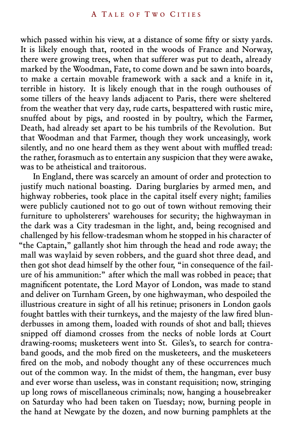
Literary Style (Dickens’ A Tale of Two Cities):

It was the best of times, it was the worst of times, it was the age of wisdom, it was the age of foolishness, it was the epoch of belief, it was the epoch of incredulity, it was the season of Light, it was the season of Darkness, it was the spring of hope, it was the winter of despair…

Professional Writing Style:

It was:

  • The best of times and the worst of times
  • The age of wisdom and the age of foolishness
  • The epoch of belief and the epoch of incredulity
  • The season of Light and the season of Darkness
  • The spring of hope and the winter of despair

Notice how the bulleted version is easier to scan and compare contrasting ideas.

4. Use Numbered Lists to Show Sequence & Hierarchy

Lists share all the positive attributes of bullets: they create white space readers love, placing emphasis by drawing the reader’s eye to what you want to highlight.

Lists are preferable to bullets when:

  • A series of steps must be completed in order
  • You’re presenting a process or procedure
  • You need to reference specific items later (“As noted in step 3…”)

Numbering sections is very common in legal and technical genres where multiple people collaborate on a document or where precision and reference are critical.

Pro tip: Use the style tag for lists in your word processor to maintain consistent formatting and easy global updates.

5. Use Paragraphs Strategically to Chunk Information

In years past, especially prior to the internet, writers had less competition for readers’ attention. This may explain why Victorian-era writers could write lengthy paragraphs that spanned entire pages.

While readers of literary fiction who read for pleasure may still have patience for longer paragraphs, in workplace and academic writing there’s been a decisive move toward shorter paragraphs—typically 3-7 sentences.

Modern paragraph guidelines:

  • One main idea per paragraph
  • Topic sentence near the beginning
  • Supporting sentences that develop the idea
  • Transition to the next paragraph
  • Visual break (white space) between paragraphs

Dense, unbroken text blocks intimidate readers and reduce comprehension. Breaking content into digestible chunks respects your reader’s cognitive load.

6. Use Headings to Signal Structure and Content

For some genres, headings would be considered too impersonal or technical. You certainly don’t want to see headings in a suspense novel or literary essay. However, headings are increasingly expected in academic writing and workplace writing.

Even conventional headings in scientific writing like “Introduction,” “Results,” “Discussion,” and “Conclusions” are useful because they give readers a sense of what’s covered within each section. Skilled readers scan through documents on first reading, noting the content of headings to understand the overall message.

Types of headings:

  • Generic headings: Standard sections (Introduction, Methodology, Conclusion)
  • Descriptive headings: Headings that preview content (like the headings used in this article)

Descriptive headings are more helpful because they cue readers about upcoming content. Compare:

  • Generic: “Results”
  • Descriptive: “Student Test Scores Improved 23% After Intervention”

Heading best practices:

  • Use your word processor’s style tags (H1, H2, H3) for easy formatting updates
  • Limit yourself to three levels of headings maximum—more creates confusion
  • Ensure all headings at the same level are grammatically parallel (all questions, all verb phrases, or all noun phrases)
  • Make headings visually distinct through size, weight, color, or spacing

For specific formatting guidelines, see:

7. Use Visual Elements to Break Up Text

Well-chosen visual elements—charts, figures, graphs, and tables, illustrations, icons, diagrams—don’t just add visual interest. They convey information more efficiently than text alone and provide natural scanning stops that prevent reader fatigue.

When to use visuals:

  • To show trends or comparisons (charts, graphs)
  • To illustrate processes or relationships (diagrams, flow charts)
  • To organize complex data (tables)
  • To create emphasis or aid navigation (icons)

Remember: every visual element should serve a purpose. Decorative images that don’t support your message can distract readers and undermine your credibility.

For more on strategic visual communication, see Information Design and Data Visualization.

Integrating Page Design with Broader Design Principles

Page design doesn’t exist in isolation. It’s one application of broader design principles that govern all effective visual communication. When designing pages, consider how you’re applying:

  • Contrast: Making important elements stand out
  • Repetition: Creating consistency and unity across pages
  • Alignment: Organizing elements to create visual connections
  • Proximity: Grouping related items together
  • Balance: Distributing visual weight across the page
  • Emphasis: Directing the reader’s attention to key information

For a deeper dive into these concepts, explore:


Accessibility and Universal Design

Good page design isn’t just about aesthetics or efficiency—it’s about ensuring all readers can access your content. Universal Design Principles remind us to consider readers with different abilities, devices, and contexts.

Accessible page design includes:

  • Sufficient color contrast for readers with visual impairments
  • Logical heading hierarchies for screen reader users
  • Adequate white space for readers with cognitive differences
  • Readable font sizes and clear typography
  • Alternative text for images and visual elements

For comprehensive guidance, see Universal Design Principles – How to Design for Everyone and Usability & User Experience.

FAQs

Why Does Page Design & Scannability Matter?

Unless they’re reading poetry or a novel—some sort of pleasure reading—people want to get into a text and out of a text as quickly as possible. That’s strategy. That’s common sense. This is especially true in workplace writing and academic writing.

Good page design—pages that are scannable—facilitates both clarity and persuasion. As William Zinsser writes in On Writing Well, “Clutter is the disease of American writing. We are a society strangling in unnecessary words, circular constructions, pompous frills and meaningless jargon.” Page design helps combat this clutter by creating visual organization that guides readers to essential information.

Moreover, page design directly impacts your authority as a writer. Research consistently shows that well-designed documents receive higher credibility ratings and are perceived as more authoritative. When readers encounter a professionally designed page, they’re more likely to trust the content and engage deeply with your ideas. Conversely, poorly designed pages—cluttered layouts, inconsistent formatting, inadequate white space—undermine your authority before readers even engage with your words.

You can enhance the readability of your texts by giving thought to the design of your documents. By designing for scannability, you help your audience better understand your organization, thesis, hypothesis, or argument—which are all fundamental components of clarity in communication.

How is Page Design Different from Information Design?

Page design focuses on the layout and visual arrangement of content on individual pages or screens. Information design is broader—it encompasses how information is structured, organized, and presented across an entire document or system, including information architecture, navigation, and how users find and understand content.

Think of it this way: page design is tactical (this specific page), while information design is strategic (the entire information ecosystem).

Do Different Fields Have Different Page Design Expectations?

Absolutely. Different disciplines and professions have established conventions:

  • Scientific writing: Often follows rigid structures (IMRaD: Introduction, Methods, Results, and Discussion) with specific heading hierarchies
  • Legal writing: Frequently uses extensive numbering systems and formatted sections
  • Business writing: Emphasizes brevity, executive summaries, and visual data presentation
  • Humanities writing: May use fewer headings and allow for longer, more developed paragraphs
  • Web writing: Requires shorter paragraphs, more headings, and mobile-responsive design

Always research the conventions expected by your audience. When in doubt, consult APA or MLA guidelines for academic writing, or style guides specific to your profession.

Can Page Design Improve My Grades or Professional Success?

Yes! Research consistently shows that well-designed documents:

  • Receive higher credibility ratings
  • Are perceived as more authoritative
  • Are more likely to be read completely
  • Lead to better comprehension and retention
  • Create positive impressions of the author

In academic settings, professors are more likely to engage deeply with well-designed papers. In professional settings, clients and colleagues are more likely to trust and act on well-designed documents. Page design is not just cosmetic—it’s a fundamental communication tool.

What Are the Most Common Page Design Mistakes?

Based on usability research and writing center consultations, the most common mistakes include:

  1. Too much visual clutter: Overcrowding pages with text, images, and elements
  2. Inconsistent formatting: Random heading styles, varied fonts, irregular spacing
  3. Poor contrast: Light gray text on white backgrounds, low-contrast color combinations
  4. Walls of text: Long, unbroken paragraphs with no visual relief
  5. Meaningless visuals: Decorative images that don’t support the message
  6. Inadequate white space: Margins too narrow, lines too close together
  7. Too many fonts: Using 4, 5, or more different typefaces
  8. Ignoring hierarchy: Making everything look equally important (which means nothing stands out)

Where Can I Learn More About Design?

This article is part of a comprehensive design section in Writing Commons. To deepen your understanding, explore:

Related Concepts

Design – The Visual Language That Shapes Our World

Why does “design” play such a profound role in communication, persuasion, clarity — and, especially, technical communication?

  1. Design Principles – The Big Design Principles You Need to Know to Create Compelling Messages
  2. Elements of Art – How to Leverage the Power of Art to Make Visually Compelling Documents
  3. Elements of Design – Master the Fundamentals of Visual Composition
  4. Information Design and Architecture
  5. Page Design – How to Design Messages for Maximum Impact
  6. Universal Design Principles – How to Design for Everyone
  7. Usability & User Experience
  8. Visualization Techniques
Share this post:

Creative Challenges

The Language of Work: Style, Rhetoric, and Visual Design in Professional Communication
Learn to shape clear, credible, and usable workplace documents by applying visual language, information architecture, do...

Learn More

The Infographic Project
Understand the three deliverables associated with the infographic assignment. Get a sense of the big picture regarding e...

Learn More

Memo on Design Choices
Learn how to justify your design choices for the infographic assignment. Reflect on what you’ve learned about visu...

Learn More

The Elements of Style